First part of the tutorial was a good introduction to DORF, which resulted in the following app (more or less): http://embed.plnkr.co/TV4H5K/.
Main problems identified in the first part:
'Save' instead of 'Submit'update function is not the perfect way of acting with DORF ObjectPutting a characteristic red star after the label of the required field is really trivial in DORF. All you need is requiredWithStar set to true somewhere inside DorfModule.forRoot method in app.module.
Currently we are having 2 buttons and one of them is not needed. Also, they are ugly. The solution for this - once again
- is a modification of DorfModule.forRoot method. The end result can look like this:
DorfModule.forRoot({
  css: {
    section: 'row',
    wrapper: 'form-group col-12 row',
    label: 'col-2 col-form-label',
    fieldGeneralization: 'col-10',
    htmlField: 'form-control',
    buttons: {
      save: 'btn btn-primary',
      reset: 'hidden-xs-up'
    }
  },
  dorfFields: [{
    tag: DorfField.CHECKBOX,
    css: {
      wrapper: 'checkbox col-12 row',
      htmlField: 'checkbox'
    }
  }],
  requiredWithStar: true
})
Styles are taken directly from Bootstrap.
Time for something harder. In the current version of DORF, there are no mechanisms for customizing button text. But we can still achieve our goal by:
Let’s take a look at the first option.
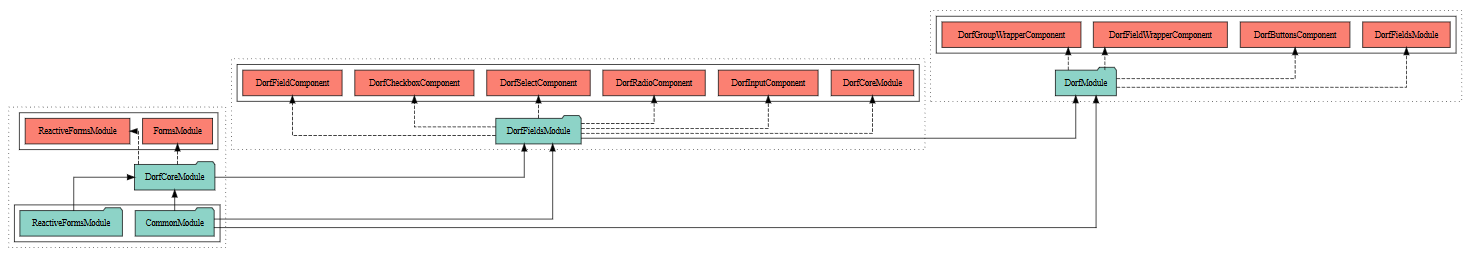
DORF is written in a modular way. Dependencies are presented below:
There are 3 main modules:
DorfCoreModule - an essence, which exports the configuration, ReactiveFormsModule from Angular
and abstract TypeScript classes, used later by the fields.DorfFieldsModule - module which collects field-related stuff: input, select, radio,
checkbox and the field generalization. The idea behind one module for all the field components is
simple - it should allow an easy switch. E.g. it is doable to define components with DORF-like selectors which use
e.g. Angular Material behind the scenes. Then, a new module containing them should be used on top of DorfCoreModule.
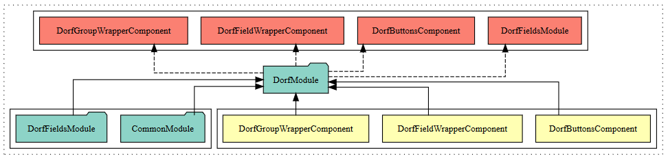
Sooner or later DORF should be improved to allow even an easier way for overriding the default fields.DorfModule - final module, which uses the previous ones and adds wrappers and buttons.As written above, DorfModule stores buttons component. Let’s take a deeper look at this:
What needs to be done is similar to what happened in definition-extras example from the official DORF repository.
DorfButtonsComponent has HTML template which is the source of our problem. And the solution is to create
a new component, e.g. src/app/ext/custom-buttons-component.ts:
import { Component } from '@angular/core';
import { DorfButtonsComponent } from 'dorf';

@Component({
  selector: 'dorf-buttons',
  template: `
  <section [ngClass]="config.css.buttons?.group">
    <button (click)="submit()" [ngClass]="config.css.buttons?.save" [disabled]="!form || !form.valid">Submit</button>
  </section>
  `
})
export class CustomButtonsComponent extends DorfButtonsComponent { }
HTML was modified to match our requirements. We even removed unneeded “Reset” button. Hints:
New component should be registered in the module:
import { BrowserModule } from '@angular/platform-browser';
import { NgModule } from '@angular/core';
import { FormsModule } from '@angular/forms';
import { HttpModule } from '@angular/http';

import {
  DorfFieldsModule,
  DorfField,
  DorfFieldWrapperComponent,
  DorfGroupWrapperComponent
} from 'dorf';

import { CustomButtonsComponent } from './ext/custom-buttons-component';

import { UserFormComponent } from './user/user-form.component';
import { AppComponent } from './app.component';

@NgModule({
  declarations: [
    UserFormComponent,
    AppComponent,
    CustomButtonsComponent,
    DorfFieldWrapperComponent,
    DorfGroupWrapperComponent
  ],
  imports: [
    BrowserModule,
    FormsModule,
    HttpModule,
    DorfFieldsModule.forRoot({
      css: {
        section: 'row',
        wrapper: 'form-group col-12 row',
        label: 'col-2 col-form-label',
        fieldGeneralization: 'col-10',
        htmlField: 'form-control',
        buttons: {
          save: 'btn btn-primary'
        }
      },
      dorfFields: [{
        tag: DorfField.CHECKBOX,
        css: {
          wrapper: 'checkbox col-12 row',
          htmlField: 'checkbox'
        }
      }],
      requiredWithStar: true
    })
  ],
  providers: [],
  bootstrap: [AppComponent]
})
export class AppModule { }
Note that we switched from DorfModule to DorfFieldsModule, so it was needed to register DorfFieldWrapperComponent and DorfGroupWrapperComponent “manually”.
The end result for this part is available here.
Overriding DORF pieces is a powerful technique, but it is too much in our case. Let’s undo the last changes and modify
DorfForm decorator on UserFormComponent:
@DorfForm({
  renderWithoutButtons: true
})
Then, let’s add <button class="btn btn-primary">Submit</button> manually to the template
of AppComponent.
What if I told you that you can use DORF and enjoy the [(ngModel)]-like experience? Let’s start the modification
with removing the update function from our model. Then, for every field we want an immediate updating, we
have to add updateModelOnChange: true option:
@DorfObject()
export class User {
  @DorfInput({
    label: 'Username',
    type: 'input' as InputType,
    validator: Validators.required,
    updateModelOnChange: true
  })
  private _login: string;

  @DorfInput({
    label: 'Password',
    type: 'password' as InputType,
    validator: Validators.required,
    updateModelOnChange: true
  })
  private _password: string;

  @DorfCheckbox({
    innerLabel: 'I accept the terms and conditions',
    validator: Validators.requiredTrue,
    updateModelOnChange: true
  })
  private _acceptance: boolean;

  constructor(options?: IUser) {
    if (options) {
      this._login = options._login;
      this._password = options._password;
      this._acceptance = options._acceptance;
    }
  }

  get login() { return this._login; }
  get password() { return btoa(this._password); }
  get acceptance() { return this._acceptance; }

  get basicAuth() {
    if (this._login && this._password) {
      return btoa(`${this._login}:${this._password}`);
    }
  }
}
Bonus: you can specify debounce parameter, to delay an update. It expects a number of milliseconds as a value.
It is similar to one of ngModelOptions parameter from Angular 1.3.
That’s it. Having such updating, it is possible to consume user directly in AppComponent.
We fulfilled all the requirements from the previous part and extended our DORF knowledge:
DorfModule.forRoot method allows not only assigning CSS classes to fields, but also to buttons; it also
has additional parameters, e.g. for setting a red star on the required fields[(ngModel)]-like updating. Behind the scenes, immediate updating uses events, so it is a
reactive way, not a two-way bindingFinished app is presented here: http://embed.plnkr.co/0LqHQa/.
DORF is still under the development, but its code already allows for handling plenty of use cases and scenarios, which are not yet presented in tutorials.
